An Introduction to CSS
A primer on how CSS attaches styles, resolves conflicts, sizes boxes, hides and overlays content, and lays out modern UI with flexbox and media queries.
Ben Houston • • 11 min read
CSS can feel larger than it is because it has two jobs at once. It chooses which elements a rule applies to, and then it tells the browser how those elements should look and sit on the page.
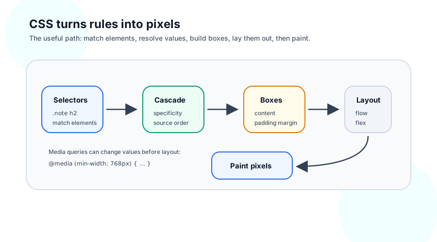
This article is a map, not a reference manual. It follows the path the browser roughly follows: attach styles, match selectors, resolve conflicts, build boxes, lay those boxes out, position a few of them specially, and adapt the result to different screen sizes.
What CSS Is Doing#
HTML describes what is on the page:
<article class="note">
  <h2>Shipping update</h2>
  <p>The new release goes out tomorrow.</p>
</article>
CSS describes how those elements should be presented:
.note {
  padding: 24px;
  border: 1px solid #cbd5e1;
}

.note h2 {
  margin: 0 0 8px;
  font-size: 1.25rem;
}
The browser matches rules against elements, calculates the final value for each property, lays out rectangular boxes, and paints the result. Most CSS surprises come from one of those steps being different from what you expected.
Stylesheets and Inline Styles#
CSS can reach an element in a few common ways.
An external stylesheet is the usual place for reusable page or component styles:
<link rel="stylesheet" href="/styles.css" />
A <style> block puts CSS directly in the document. It is useful for examples, experiments, or small pages:
<style>
  .warning {
    color: #b45309;
  }
</style>
An inline style lives on one element:
<p style="color: #b45309;">Check the deployment window.</p>
Inline styles are direct and sometimes useful for values that come from code, such as a measured position or a user-selected color. They are also hard to reuse and hard to override because they outrank normal stylesheet rules. In a React app, style={{ color: "darkorange" }} is still an inline style; the syntax changed, but the cascade behavior did not.
Most durable styling belongs in stylesheets. Inline styles are best kept for values that really are unique to one element or one runtime calculation.
Selectors#
A selector says which elements a rule matches.
The simplest selectors match an element type, a class, or an id:
button {
  font: inherit;
}

.primaryAction {
  background: #2563eb;
  color: white;
}

#checkout {
  max-width: 720px;
}
Type selectors are broad. Class selectors are the everyday tool because many elements can share the same class and an element can have more than one class. Id selectors are very specific, so they are better for document anchors or JavaScript hooks than ordinary styling.
Selectors can also describe relationships in the document tree:
<nav class="siteNav">
  <a href="/">Home</a>
  <a href="/blog">Blog</a>
  <button>Subscribe</button>
</nav>
.siteNav a {
  color: #334155;
}

.siteNav > button {
  margin-left: auto;
}

.siteNav a + a {
  margin-left: 16px;
}
.siteNav a matches any link inside .siteNav. .siteNav > button matches a button that is a direct child. .siteNav a + a matches a link that immediately follows another link.
Pseudo-classes add state or position to a selector:
.siteNav a:hover {
  color: #0f172a;
}

.siteNav a:focus-visible {
  outline: 2px solid #2563eb;
  outline-offset: 4px;
}
They are still selectors. They do not create behavior by themselves; they match when a condition is true.
Cascade, Specificity, and Inheritance#
When two rules set the same property on the same element, CSS needs a winner. The full cascade has several layers, but the everyday version is:
- Important declarations beat normal declarations.
- More specific selectors beat less specific selectors.
- If specificity ties, the later rule wins.
button {
  color: #334155;
}

.primaryAction {
  color: white;
}
A <button class="primaryAction"> gets white text because a class selector is more specific than a type selector.
Source order matters when specificity ties:
.primaryAction {
  background: #2563eb;
}

.primaryAction {
  background: #1d4ed8;
}
The second rule wins because both selectors have the same specificity and the second one appears later.
Inheritance is a different idea. Some properties naturally pass from parent to child. Text color and font family inherit. Padding, margin, border, width, and height usually do not.
.article {
  color: #334155;
  font-family: Georgia, serif;
  padding: 32px;
}
Paragraphs inside .article inherit the color and font, but they do not each receive their own 32 pixels of padding. That distinction keeps document-level typography convenient without making layout explode.
When a rule does not seem to apply, inspect the element and ask three questions: did the selector match, did another rule win, or did you expect inheritance from a property that does not inherit?
The Box Model#
Every visible element produces one or more rectangular boxes. The basic box has four layers.
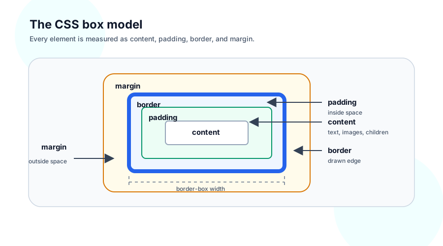
The content is where text, images, or child elements live. Padding adds space inside the element, between the content and the border. The border draws around the padding and content. Margin adds space outside the element, between this box and neighboring boxes.
.panel {
  box-sizing: border-box;
  width: 320px;
  padding: 24px;
  border: 1px solid #cbd5e1;
  margin: 32px auto;
}
box-sizing: border-box means the declared width includes content, padding, and border. Without it, width: 320px applies only to the content box, so padding and border make the element wider than 320 pixels. Most modern projects set box-sizing: border-box globally because it makes sizing easier to reason about:
*,
*::before,
*::after {
  box-sizing: border-box;
}
Width and height are not always final commands. min-width, max-width, min-height, and max-height describe limits. Content can force a box to grow unless you tell it how to handle overflow.
Margins also have one historical wrinkle: vertical margins between normal block elements can collapse together. If two paragraphs each have vertical margins, the browser may use the larger margin instead of adding both. Padding and flex/grid gaps avoid that surprise when you need predictable spacing.
Display and Hiding#
The display property decides what kind of box an element creates and how it participates in normal layout flow.
display: block starts on a new line and fills the available inline space by default. Headings, paragraphs, sections, and divs are block-level by default.
.sectionTitle {
  display: block;
  margin-bottom: 12px;
}
display: inline flows with text. Width and height do not work the same way on inline boxes because they are part of a line of text.
.quietLink {
  display: inline;
  color: inherit;
}
display: inline-block flows inline but keeps block-like sizing. It is useful for small controls that sit in text flow.
.tag {
  display: inline-block;
  padding: 2px 8px;
}
Hiding has different meanings:
.removed {
  display: none;
}

.invisible {
  visibility: hidden;
}

.transparent {
  opacity: 0;
}
display: none removes the element from layout as if it did not create a box. visibility: hidden keeps the space but does not paint the element. opacity: 0 makes the element transparent, but it can still receive pointer events unless you change that too.
Choosing the right hiding method matters for layout, accessibility, and interaction. A collapsed menu often uses display: none; a reserved loading slot might use visibility: hidden; a fading animation might use opacity.
Positioning and Overlays#
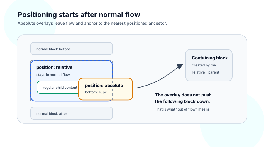
Normal layout flow places boxes one after another. Positioning lets a box stay in flow, move relative to itself, or leave flow and anchor to another box.
position: static is the default. The element participates in normal layout, and top, right, bottom, and left do not move it.
position: relative keeps the element in normal flow, but allows offsets and creates a positioning context for absolutely positioned descendants:
.photoFrame {
  position: relative;
}
position: absolute removes an element from normal flow and positions it relative to the nearest ancestor that has a non-static position:
.photoCaption {
  position: absolute;
  left: 16px;
  right: 16px;
  bottom: 16px;
}
If no positioned ancestor exists, the absolute element anchors farther up the page than you probably intended. That is why overlay patterns often pair position: relative on the container with position: absolute on the overlay.
position: fixed anchors to the viewport. It is common for global headers, cookie banners, and modal backdrops. position: sticky behaves like normal flow until a scroll threshold, then sticks within its scrolling container.
Stacking is controlled with z-index, but only positioned elements and stacking contexts participate the way beginners expect. A useful first rule is: if z-index appears ignored, check whether the element is positioned and whether a parent created a stacking context.
Flexbox Layout#
Flexbox is the everyday layout tool for one-dimensional UI: rows, columns, nav bars, button groups, side-by-side panels, and forms. It lays out items along a main axis and aligns them along a cross axis.
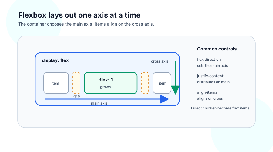
The parent becomes a flex container:
.toolbar {
  display: flex;
  align-items: center;
  gap: 16px;
}
Its direct children become flex items. flex-direction chooses the main axis:
.toolbar {
  display: flex;
  flex-direction: row;
}

.stack {
  display: flex;
  flex-direction: column;
  gap: 12px;
}
In a row, the main axis runs left to right in left-to-right writing modes, and the cross axis runs top to bottom. In a column, those axes swap.
justify-content distributes items along the main axis:
.toolbar {
  justify-content: space-between;
}
align-items aligns items along the cross axis:
.toolbar {
  align-items: center;
}
gap puts consistent space between items without asking each child to manage its own margin:
.toolbar {
  gap: 16px;
}
The flex shorthand controls how an item grows, shrinks, and chooses its starting size:
.search {
  flex: 1;
}

.actions {
  flex: 0 0 auto;
}
flex: 1 says the item can take available space. flex: 0 0 auto says the item keeps its natural size. You do not need to memorize every combination at first. Learn the common contrast: one item grows, another item stays content-sized.
Here is a complete small layout:
<form class="searchBar">
  <input class="searchInput" placeholder="Search articles" />
  <button>Search</button>
</form>
.searchBar {
  display: flex;
  gap: 12px;
}

.searchInput {
  flex: 1;
  min-width: 0;
}
min-width: 0 is a practical flexbox detail. Flex items can resist shrinking because their default minimum size follows their content. Setting min-width: 0 lets a growing text input also shrink inside a narrow container.
CSS Grid is better when you need two-dimensional layout with rows and columns working together. Flexbox is a good default when you are arranging a line or a stack of things.
Media Queries#
Media queries apply CSS only when a condition is true. They are how the same document adapts to different viewport sizes, user preferences, and output devices.
A mobile-first stylesheet starts with the narrow layout, then adds rules as space becomes available:
.productHeader {
  display: flex;
  flex-direction: column;
  gap: 24px;
}

@media (min-width: 768px) {
  .productHeader {
    flex-direction: row;
    align-items: center;
  }
}
The media query did not introduce a new layout system. It changed a property you already know. That is the right mental model: responsive design is often the same selectors and properties under different conditions.
Media queries can also respect user preferences:
@media (prefers-reduced-motion: reduce) {
  * {
    scroll-behavior: auto;
  }
}
Start with layout breakpoints and accessibility preferences. Add more specialized queries only when a real design needs them.
Getting Around#
When you are trying to understand a page, inspect an element and walk the same path the browser uses.
- Which element are you styling?
- Which selector matches it?
- Which rule wins in the cascade?
- What box did that produce?
- Is the box in normal flow, flex layout, or positioned separately?
- Did a media query change the answer at this viewport size?
That loop solves most beginner CSS mysteries. If a rule is missing, fix the selector. If a rule is crossed out, inspect specificity and source order. If spacing is wrong, look at the box model. If placement is wrong, ask whether the element is in normal flow, a flex container, or an absolute/fixed layer.
CSS has many more tools: Grid, custom properties, container queries, transitions, animations, filters, masks, and utility frameworks such as Tailwind. They are easier to learn once this base model is in place. Select elements, let the cascade resolve values, build boxes, choose a layout mode, and adapt the result with conditions.