An Introduction to Tailwind CSS
A practical introduction to Tailwind CSS for people who know basic CSS and want to understand utility classes, React className patterns, responsive variants, and why zero-runtime CSS fits modern React better than styled-components.
Ben Houston • • 9 min read
This builds on An Introduction to CSS, which covered selectors, the cascade, the box model, positioning, flexbox, and media queries.
Tailwind CSS gives you a different way to write CSS.
Instead of inventing a class name, switching to a stylesheet, and writing declarations there, you compose small utility classes directly on the element. Those classes map to normal CSS properties: padding, border, color, display, gap, position, media queries, hover states, and the rest of the browser model.
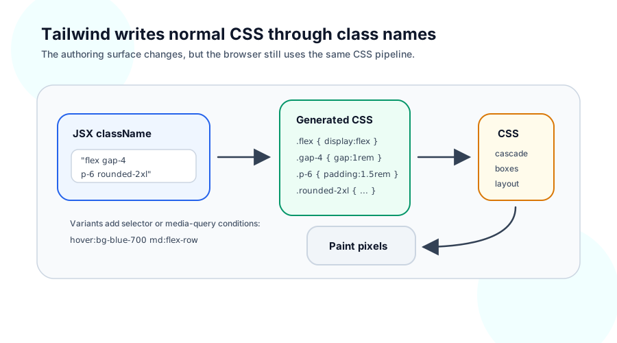
The shift can feel strange at first because the HTML or JSX gets busier. The trade is that the styling becomes local. You can read the element and see most of the presentation choices without chasing a selector through another file.
What Tailwind Actually Is#
In plain CSS, you might style a small note like this:
<article class="note">
  <h2>Shipping update</h2>
  <p>The new release goes out tomorrow.</p>
</article>
.note {
  padding: 24px;
  border: 1px solid #cbd5e1;
  border-radius: 16px;
  background: white;
}

.note h2 {
  margin: 0 0 8px;
  font-size: 1.25rem;
}
With Tailwind, you write those decisions as utility classes:
<article class="rounded-2xl border border-slate-300 bg-white p-6">
  <h2 class="mb-2 text-xl">Shipping update</h2>
  <p>The new release goes out tomorrow.</p>
</article>
Each class carries one small piece of styling:
.p-6 {
  padding: 1.5rem;
}

.border {
  border-width: 1px;
}

.border-slate-300 {
  border-color: #cbd5e1;
}

.rounded-2xl {
  border-radius: 1rem;
}
The browser still sees CSS rules. Tailwind gives those rules short, predictable names and generates the stylesheet from the class names you use.
That is the first mental model to keep: Tailwind is a CSS authoring tool. The output is CSS. The browser still matches selectors, resolves values, builds boxes, chooses layout, and paints pixels.
Utility Classes Are Still CSS Rules#
A utility class is usually a class selector with one declaration or one small group of declarations.
<div class="flex items-center gap-4">
  <span>Account</span>
  <button>Sign out</button>
</div>
Those classes map onto the flexbox properties from the CSS article:
.flex {
  display: flex;
}

.items-center {
  align-items: center;
}

.gap-4 {
  gap: 1rem;
}
The cascade still exists. Specificity still exists. If two classes set the same property, one value wins. Tailwind keeps that situation less common by giving each utility a narrow job and by generating the rules in a stable order.
You still need the cascade and specificity model when you mix Tailwind with ordinary CSS, component-library styles, inline styles, or custom utilities. Inline styles still outrank normal class rules. More specific selectors can still beat a utility. The tool changed the authoring surface, not the browser.
What Tailwind Simplifies#
Tailwind removes a few small decisions that add up.
You do not need to name every presentational wrapper:
.pricingCardHeaderActionsInner {
  display: flex;
  align-items: center;
  gap: 16px;
}
You can write the layout on the element:
<div class="flex items-center gap-4">...</div>
That sounds minor until a page has dozens of small wrappers. Many class names exist only because CSS needs a selector. Tailwind gives you selectors that already mean the property you want.
Tailwind also gives a project a shared scale. p-4, p-6, and p-8 come from the spacing scale. text-slate-700 and border-slate-300 come from the color palette. rounded-lg and rounded-2xl come from the radius scale.
Those constraints make design choices more consistent. You can still reach for arbitrary values when you need them:
<div class="w-[37rem]">...</div>
But the default path nudges you toward shared values, which helps a team keep a UI from drifting one pixel and one hex code at a time.
State variants map onto pseudo-classes:
<button
  class="bg-blue-600 px-4 py-2 text-white hover:bg-blue-700 focus-visible:outline-2 focus-visible:outline-offset-2"
>
  Save
</button>
hover:bg-blue-700 means "apply this background utility under :hover." focus-visible:outline-2 means "apply this outline width under :focus-visible." These are the same selector states from the CSS primer, written as prefixes.
Responsive variants map onto media queries:
<section class="flex flex-col gap-6 md:flex-row md:items-center">...</section>
The base classes describe the narrow layout. The md: classes apply when the viewport reaches the configured medium breakpoint. That is the same mobile-first pattern as a CSS media query:
.productHeader {
  display: flex;
  flex-direction: column;
  gap: 1.5rem;
}

@media (min-width: 768px) {
  .productHeader {
    flex-direction: row;
    align-items: center;
  }
}
If a responsive Tailwind class surprises you, use the same media-query model: start with the base class, then layer the breakpoint-specific class on top.
Composing With className#
React uses className instead of HTML's class attribute, but the browser receives classes either way.
type SearchBarProps = {
  placeholder?: string;
};

export function SearchBar({ placeholder = 'Search articles' }: SearchBarProps) {
  return (
    <form className="flex gap-3">
      <input className="min-w-0 flex-1 rounded-lg border border-slate-300 px-3 py-2" placeholder={placeholder} />
      <button className="rounded-lg bg-blue-600 px-4 py-2 text-white">Search</button>
    </form>
  );
}
The flexbox article used this CSS:
.searchBar {
  display: flex;
  gap: 12px;
}

.searchInput {
  flex: 1;
  min-width: 0;
}
The Tailwind version says the same thing in place:
<form className="flex gap-3">
  <input className="min-w-0 flex-1" />
</form>
This is why Tailwind works well with component code. A component already owns a small piece of markup and behavior. Tailwind lets that component own the nearby presentation too.
For conditional styling, you usually compose class strings from props:
type ButtonProps = {
  active?: boolean;
  children: React.ReactNode;
};

export function Button({ active = false, children }: ButtonProps) {
  const tone = active ? 'bg-blue-600 text-white' : 'bg-white text-slate-900 hover:bg-slate-50';

  return <button className={`rounded-lg border border-slate-300 px-4 py-2 ${tone}`}>{children}</button>;
}
Many projects use helpers such as clsx, classnames, or a local cn() function once conditional classes get longer. The important part is still plain: React computes a string, and the browser matches class selectors.
Why Tailwind Pairs Well With React#
React components already group markup, state, events, and composition. Tailwind fits that shape because a component can show its visual structure in the same file as its JSX.
export function ProductCard() {
  return (
    <article className="rounded-2xl border border-slate-200 bg-white p-6 shadow-sm">
      <h2 className="text-xl font-semibold text-slate-950">Trail Shoes</h2>
      <p className="mt-2 text-slate-600">Lightweight running shoes for wet city paths.</p>
      <button className="mt-4 rounded-lg bg-slate-950 px-4 py-2 text-white">Add to cart</button>
    </article>
  );
}
That component can render on the server or in the browser. Tailwind classes are strings. They do not need React state, effects, Context, or a runtime style registry.
That matters more in the React Server Components world. As covered in React Server Components, a Server Component can render JSX without shipping its component implementation to the browser. A Tailwind-styled Server Component can return host elements with class names, and the CSS file can already be available to the page.
export default async function ProductPage({ id }: { id: string }) {
  const product = await getProduct(id);

  return (
    <main className="mx-auto max-w-3xl p-6">
      <h1 className="text-3xl font-bold text-slate-950">{product.name}</h1>
      <p className="mt-4 text-slate-700">{product.description}</p>
    </main>
  );
}
No "use client" directive appears here because the styling does not require browser code. If you later add an interactive cart button, that button can become a Client Component, and the surrounding Tailwind-styled page can stay server-only.
Why styled-components Fell Out of Favor#
styled-components solved a real problem for React teams. It let you write scoped component styles in JavaScript, colocate those styles with components, pass props into style rules, and use React Context for theming.
const Card = styled.article<{ $featured?: boolean }>`
  padding: 24px;
  border-radius: 16px;
  border: 1px solid ${({ theme }) => theme.colors.border};
  background: ${({ $featured, theme }) => ($featured ? theme.colors.highlight : 'white')};
`;
That style felt natural in the client-rendered React era. The component ran in JavaScript, the style code ran near it, and a ThemeProvider could pass theme values through React Context.
Modern React changed the pressure on that model. Server Components draw a module boundary between code that runs only on the server and code that ships to the browser. They cannot use useState, useEffect, browser APIs, or ordinary React Context. That last point matters for styled-components because its familiar theming model depends on Context.
The maintainers put styled-components into maintenance mode in March 2025. Existing apps kept working, and the package remained available. Maintenance mode meant the main API had stabilized, the maintainer energy had changed, and the React styling ecosystem had moved toward approaches with less runtime work.
React Server Components made the trade-off sharper. A runtime CSS-in-JS library has to answer awkward questions:
- Where does style generation run when the component is server-only?
- How does theming work without Context in Server Components?
- How does the framework deliver generated CSS without adding client JavaScript?
- What happens when inline style tags affect selectors such as
:first-child?
styled-components v6.3 and v6.4 added RSC support, including inline style delivery and RSC-compatible theming helpers. That work made the library more usable in modern React, but it also showed why the model had become harder. The library needed special machinery to fit a world where not every component is allowed to run as client JavaScript.
Tailwind takes a simpler path. It turns class names into CSS ahead of time. The component renders strings. Server Components, Client Components, SSR, hydration, and static pages can all use the same classes because Tailwind does not depend on React Context or runtime style injection.
That is the real lesson. styled-components fit a React app shape where most component code ran in the browser. React apps changed shape. When more UI can render on the server without shipping component code, styling tools that produce static CSS have a natural advantage.